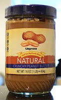
Having a recognizable figure or color in your label can increase your chances dramatically Take for example these peanut butter jars below. If the name was not present, you would still recognize who it is. Now look at the next one. You can't see the name clearly. Which one do you think will draw the younger and older crowd? Think about how your eyesight is when you are in your 50's or 60's. Now I know you must be thinking, those are not the consumers we are targeting. Why not? They have money as well. Consumers in those age brackets sell on word of mouth as well. Those age brackets are perfect to target. They tell their friends and sell more for the company. Anyone with a child knows that if it's a good enough product for my child, it will make others reflect on what they are feeding their child. This is the power of selling.
 |
| Label jumps out at you and everyone is familiar with it. www.linkedin.com/in/jeffreybernhard/ |
 |
| Label is quiet and has no real draw to the consumer. |

No comments:
Post a Comment